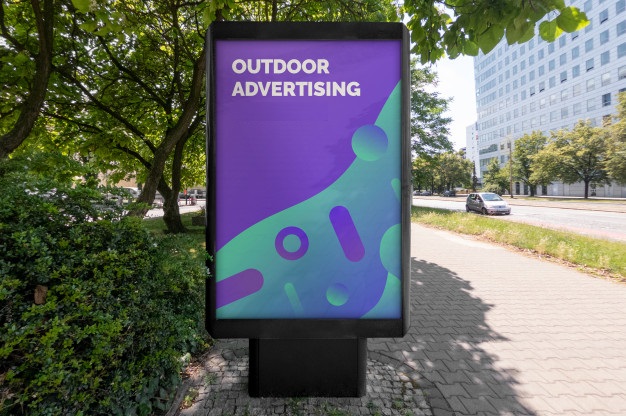
Marketing through hoardings has been practicing for years. In fact, it is one of the oldest marketing trends and is in the category of outdoor marketing which is benefiting businesses of all sizes. National, international and local businesses have recognized the power hoardings to advertise locally. The article is dedicated to telling you how should be your hoarding so that your business can get quick brand awareness.
Simple but Attractive
Simplicity plays an important role. Keep your hoarding simple, neat and clean so that it looks advertising for a professional company. Describe your product or service in just a few words. Add images or just a logo to remind people of your brand.
Focused to the Prime Subject
Do you know hoardings attract visitors when it is focused? So, it is must to be focused on your content. For example, if you are creating a hoarding for a product launch, make sure the prime highlight should be that product regardless of your other services. In the same manner, if you are giving a special discount, the hoarding content should talk about that discount.
Keep Attention to the Font
When a hoarding is designed, it is necessary to give special attention to the font size and style. Instead of playing with multiple font styles, choose a simple and readable font like Cambria, New Times Roman, etc… A hoarding which is readable from far is said to be the most successful hoarding design. So, keep the font style simple and attractive. The size should standard. It should not be too large or too small.
Colour Contrast
During designing of the hoarding, it is necessary that the colour of the font, board and the image is chosen wisely. Contrast colour is always appreciated because they are visible and eye catchy. For example, if the hoarding board colour is white, choose the font in red, black, blue or any dark colour. The contrast colour choice will make your hoarding design appreciable.
Vinyl Billboards
Do you know a vinyl billboard shine goes last long? It will not easily fade at times. A hoarding bears all types of harsh weather like heat, rain and storm. A vinyl billboard design doesn’t easily fade in the harsh weather. If your planning is to display hoarding for months, it is ideal to choose a vinyl billboard instead of hand-painted hoarding.
Pictures Tell Thousand Words
If you feel that limited words cannot define your services well to the targeted audiences, go for the hoarding contains images. A picture tells thousands of words. A glimpse of the image is enough to tell visitors about your brand and service. For example, if your restaurant serves seafood, an image of seafood dishes are enough to tell your targeted audience about your specialty. So, a picture is more powerful than words.
3D Hoarding Design
Today, the world has taken by storm with the concept of 3D hoarding design. It is an innovative technology that grabs the attention of visitors more easily than normal hoarding designs. The embossed artwork is presented in the manner that it looks so creative. People often like to capture such hoardings in their phone to share on social media accounts. So, they are considered one of the quickest forms to get brand recognition. If you are interested in getting 3D hoarding design service, you will have to make your pocket a little more lose for this. But it is a worthy advertising form.

